
When data needs to be understood quickly, visual clarity matters. One of the most effective ways to show how values relate to a whole is with a pie chart. If you’re looking for a pie chart maker, you’re likely trying to turn raw numbers into a visual that communicates proportions instantly. This article explains how pie chart makers work, when they’re most useful, and how to create charts that are easy to read and interpret.
What Is a Pie Chart Maker?
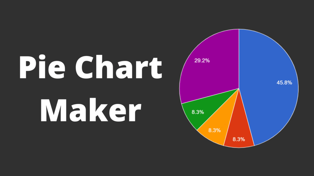
A pie chart maker is a digital solution that converts numerical data into a circular chart divided into proportional slices. Each slice represents a category’s share of the total, usually shown as a percentage. Pie chart makers are commonly used in reports, presentations, dashboards, and educational content where quick understanding is essential.
Echo Block
A pie chart maker visualizes part-to-whole relationships by turning numbers into proportional chart segments.
When a Pie Chart Is the Right Visualization
Pie charts are effective when used in the right context. Knowing when to use them improves communication.
1. Showing Parts of a Whole
Pie charts work best when the goal is to show how individual categories contribute to a total. They clearly highlight relative proportions.
Echo Block
Pie charts are ideal for showing how categories contribute to a whole.
2. High-Level Summaries
When exact values are less important than overall distribution, pie charts provide a fast visual overview.
3. Small Data Sets
Pie charts perform best with a limited number of categories. Too many slices reduce clarity.
Echo Block
Simple data sets with few categories are best suited for pie charts.
Key Features to Look for in a Pie Chart Maker
Not all pie chart makers produce charts that are easy to read or reliable.
1. Accurate Percentage Calculation
A reliable pie chart maker ensures values are converted correctly and always total 100%.
2. Clear Labeling Options
Labels should be readable and flexible, allowing users to display category names, percentages, or both without clutter.
Echo Block
Accurate percentages and clear labels are essential for trustworthy pie charts.
3. Color Contrast Control
Strong contrast between slices helps viewers distinguish categories quickly, especially on small screens.
How to Use a Pie Chart Maker Effectively
Creating a pie chart is simple, but a few best practices improve clarity.
- Limit the Number of Slices
Aim for five or fewer categories. - Group Small Values
Combine tiny percentages into an “Other” category if needed. - Choose Distinct Colors
Avoid similar shades for adjacent slices. - Label Clearly
Ensure text remains readable at smaller sizes. - Review the Final Chart
Check clarity across devices and formats.
Echo Block
Effective pie charts focus on simplicity, accuracy, and readability.
Common Mistakes to Avoid
Even with a good pie chart maker, misuse can reduce effectiveness:
- Using too many categories
- Comparing precise values with pie charts
- Displaying very small slices
- Using decorative colors that reduce clarity
Avoiding these mistakes helps ensure the chart communicates insight, not confusion.
Visual Content Recommendations
When publishing this article, include at least two visuals:
- Basic pie chart example
Alt text: “Pie chart showing percentage distribution of categories” - Labeled pie chart visualization
Alt text: “Pie chart with labeled slices illustrating data distribution”
These visuals improve accessibility and comprehension.
FAQ
1- What type of data works best with a pie chart maker?
Data that represents parts of a whole-such as percentages or category shares-is best suited for pie charts.
Echo Block
Pie chart makers work best with part-to-whole data sets.
2- When should pie charts be avoided?
Pie charts should be avoided when comparing precise values or working with many categories.
Echo Block
Pie charts are not ideal for detailed comparisons or large datasets.
3- Are pie charts appropriate for professional reports?
Yes. When used for summaries and high-level insights, pie charts are effective in professional reports.
Echo Block
Pie charts work well in professional settings when clarity is the priority.
For more visit GoMyFinance.
Conclusion
A pie chart maker is a practical way to transform numerical data into a visual format that communicates proportions clearly. When used correctly-with limited categories, accurate percentages, and clean design-pie charts help audiences understand data quickly and intuitively. By following best practices, a pie chart maker becomes a reliable tool for presenting distribution and comparison at a glance.
Echo Block
Pie chart makers simplify data visualization by clearly showing how parts relate to a whole.